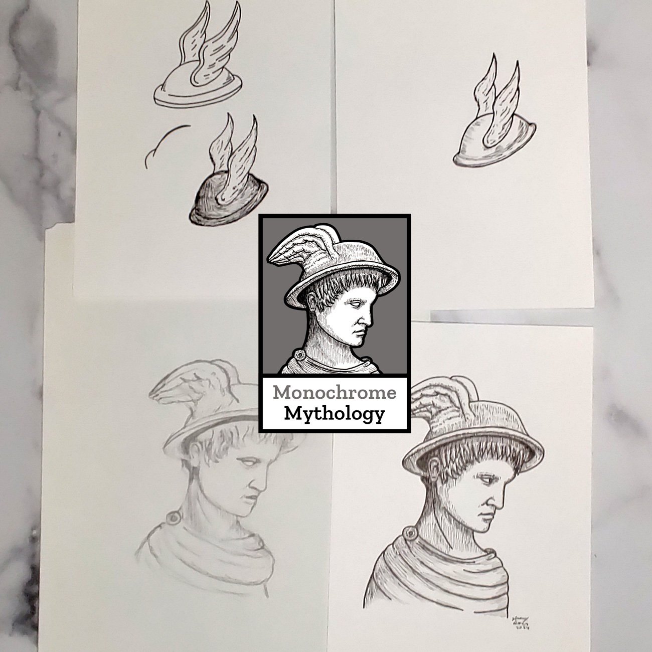
As of January, Monochrome Mythology shifted its visual identity slightly to a different Greek mythological God: Hermes! This was a choice a few weeks in the making and something I am pretty excited to bring into the public view. It’s not a choice I take lightly and requires a good amount of effort. Read on to get more insights!
Matching the Tagline
While Apollo is a fine choice to represent inspiration and other aspects of creativity, Hermes is more directly tied to storytelling. The Monochrome Mythology tagline, “Black and white storytelling,” is something that Hermes aligns to. Being able to recognize this quickly is something I value.
In Greek mythology, Hermes gave Apollo a musical instrument called the lyre and, in return, was presented the staff named Caduceus. From here, Hermes began to gain his identity as the messenger god and built up reputation from there. In some ways, I’d like to think that a metaphorical Apollo gave Monochrome Mythology its starting point and then Hermes picks up the baton to take the studio practice to new heights.
Focus on Storytelling
Portraiture and one-off realistic drawing will always be a portion of my studio practice but going forward, it will be a smaller part of that in favor of comics and other narrative or interactive art media. It’s easy to get lost in multiple goals at the same time and want to expand into every area of art marking. However, I find that I work better when a key, core project goal remains in the spotlight.
A Winged Cap

The winged cap alone was my initial idea for the new logo. Did you know that it is called Petasus? It’s easy to read and evokes the proper symbolism. However, I was never quite happy with any of the designs I came up with. Eventually, I found that showing the full Hermes character profile would fit my vision better.

I modeled some parts after a statue of Hermes and I liked the overall result. After some inking and Photoshop edits, the new logo was ready! It’s exciting to see it all come together after hours of work.

The Fate of Apollo
With the new logo, does that mean the old logo is completely gone? Nope!
I’ll be keeping the older Apollo logo around for special projects – those more connected to portraiture like coloring books. It’ll be a nice other option to have at the ready when needed for such things.
I hope your year has been off to a great start! I’m excited to continue working on Burden and other comics this year.
Keep telling stories,
Jeremy

